With these small sites, the challenge is often in creating a strong sense of place while generating value in sales or rentals. This is particularly important if the site is within a placeless context or a context that is still in the process of revitalizing or showing reinvestment, but has not yet gotten over the hump.
Similar to larger site planning efforts, this scale of Missing Middle site planning cannot simply be engineered, and the exercise cannot be simply about how many of a particular unit type we can squeeze onto a lot. There is an art to applying Missing Middle types to small sites. As a start, the site planner needs a strong understanding of the full range of Missing Middle Housing, including each type’s lot size and layout parameters, in order to effectively create a Missing Middle site plan. Which building types are interchangeable on the same lot sizes? Which types best hit different market segments? Can a type design be tweaked to meet specific site challenges? These questions (and more) frequently come up in the design process.
To get the best results, this task typically requires an architect with a strong knowledge of these types. This is also not a simple exercise like applying types to individual lots or smaller sites, so you need to be sure to assume a higher site planning budget to get this right. To put it another way, you need to be willing to spend more for these site planning services than you would for an individual site application of each of these units.
Keep in mind that there is always a delicate balance between yield and placemaking. In our experience, we have found that we can usually generate a higher yield with a better plan and better unit types.
In this two-part post, I am going to walk you through the initial evolution of a site plan that we created for a 2.7-acre brownfield site (a former gas station) in Novato, California and summarize the opportunities, challenges, type selection, and other aspects of the site planning effort. This case study will demonstrate the typical process for exploring Missing Middle at this small-site scale, examining different yields, different mixes of for sale and rental, fee simple versus stacked units, and a range of Missing Middle types on the same lot.
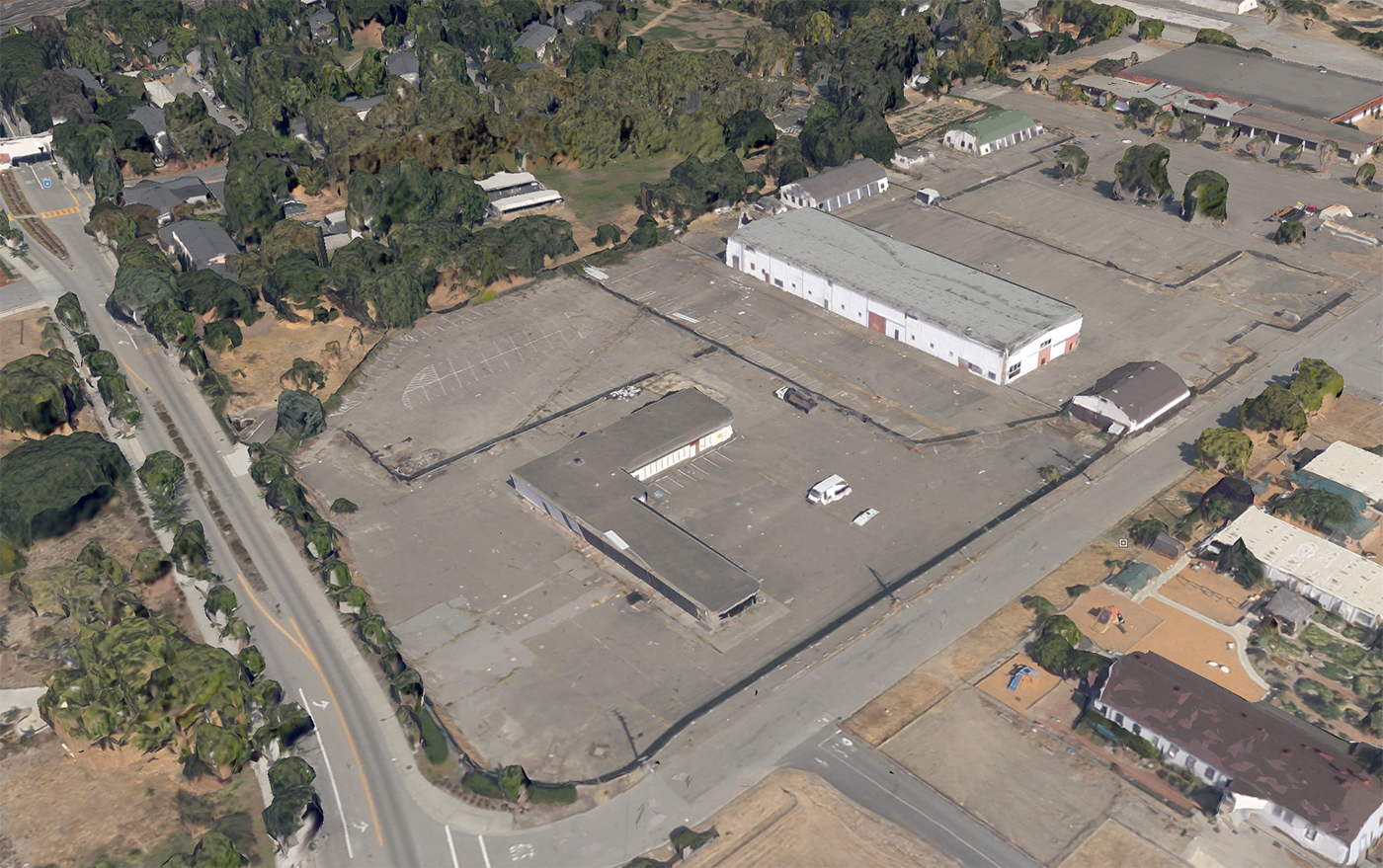
Assumptions for this project included:
- The client was initially open to exploring a full range of unit types (fee simple and stacked; for sale and rental) with an initial range of 1,600 to 2,100 square feet per unit
- The required off-street parking was 1.5 to 2 spaces per unit with no additional visitor parking. This is a bit higher than we would like and does limit efficiencies, but this is a fairly isolated site
- Maximum height of two to three stories based on zoning and context (perfect for Missing Middle Housing)
- No garages along streets—all alley loaded
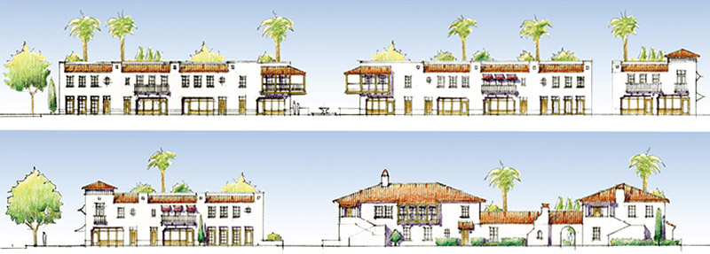
- Style of the buildings in Spanish Revival as per local design guideline requirements
Step 1 – Conceptual Studies: Exploring various types within a shared framework
As a starting point for the plan, we explored the introduction of a new street and a detached green at the center of the site. This was only possible on a site this size because it is a corner site. For non-corner sites of this size (under three acres) it is not likely that you will be able to introduce a new street.
You might ask, “Why would we introduce a new street?” For one, it serves as an organizing element and creates a sense of place, with units fronting onto the street, rather than just a plan with little hierarchy or structure that feels like a bunch of units “crammed” onto a site. Most importantly, it also enables you to create high-quality addresses fronting onto the well-designed, tree-lined street, and it provides better access for residents, emergency responders, and visitors. Finally, it plants the seeds of walkability by introducing a pattern of interconnected streets to inform the redevelopment/evolution of adjacent sites into a more walkable neighborhood. This is particularly important because this area is transitioning from a military base, and new rail service is within a five-minute walk of the site.
In order to be effective at creating a strong sense of place on sites small or large, getting the street design right is critical and often not easy. A few key pointers:
- The narrower the street, the better
- Be sure to include on-street parking. Push the municipality to enable you to count this parking toward your required parking count
- Talk with local engineers and emergency response representatives at the very start of your project to get buy-in on narrow streets
The size of the green in this framework is 4,380 square feet. This is a little small, but if a space of this size is thoughtfully designed with comfortable places to sit (possibly even with a small tot lot), it can be a great amenity for residents. The plan integrates the mail pavilion at the edge of the square, which makes a great place for residents to informally “rub elbows” with neighbors and creates a stronger sense of community.
To start, we generated a series of initial options for comparison.
Option 1-A: Mansion Apartments and Live/Work Units
We introduced three-story live/work units among flats to provide some walkability within the project and beyond, and to create an identifiable center at the edge of the project that could create a strong brand if a small cafe or coffee shop were to occupy one of these spaces. The ground floor space of one of the live/work units also functions as an excellent sales center or rental office. This option primarily integrates really nice, two-story mansion apartments—one type with four units and the other with five—that look like large homes.
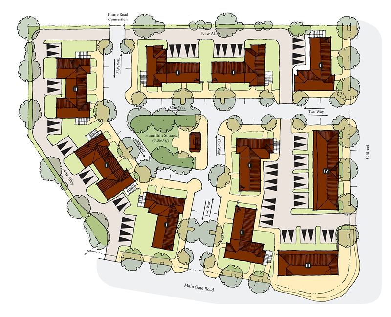

Program Summary
- Building Types: Four- and five-unit stacked mansion apartments and live/work units
- Program: 41 units in ten buildings ranging in size from 720 to 1,168 square feet. Live/work units have 750 square feet of flex space on the ground floor
- Density: 15 du/acre
- Parking: 81 spaces (50 off-street spaces and 31 on-street spaces, or 1.98 spaces per unit). No garages; parking pads only off an alley
- Open Space: 4,380 square feet of community green plus tree-lined streets
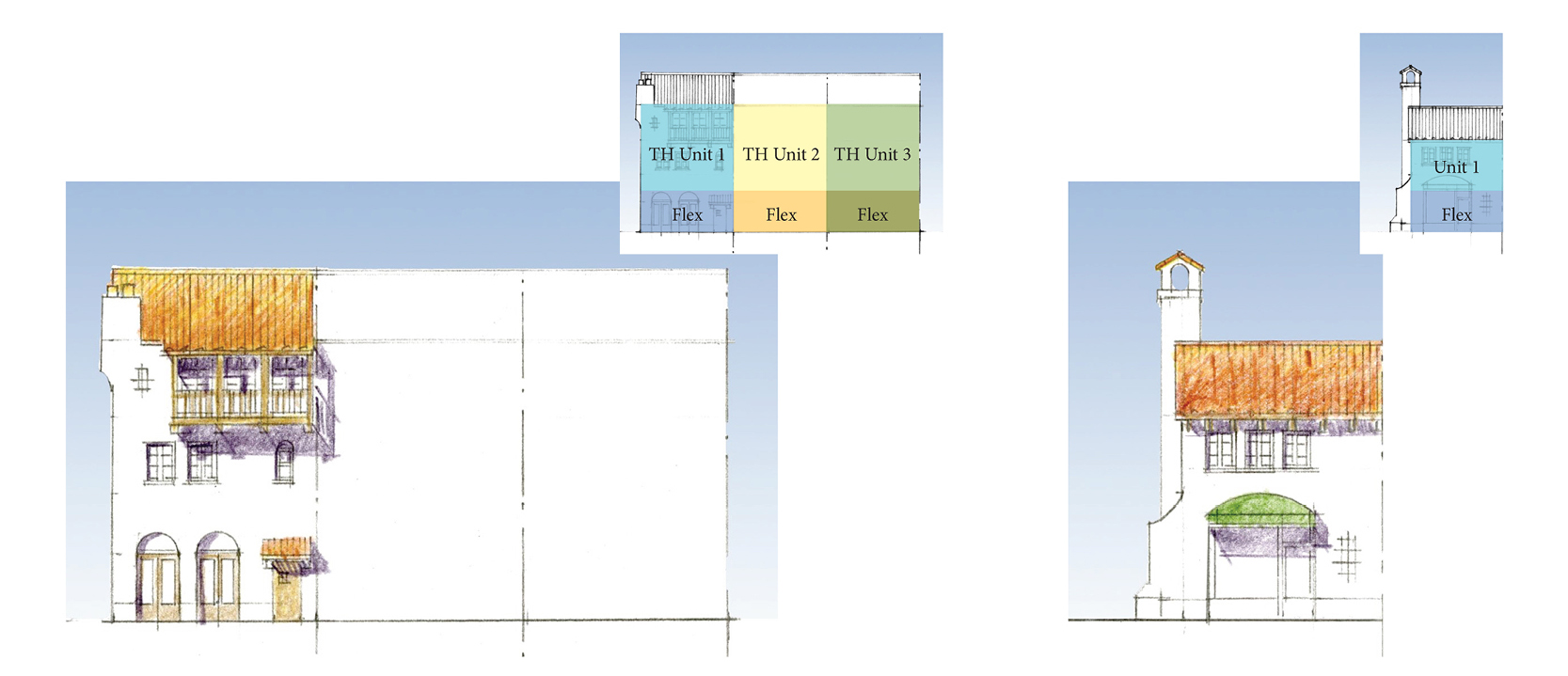
Option 1-B: All Live/Work
This option is possible because the site is not that large. There is nothing like it in the market, so it would have no competition and thus perform very well financially. Additionally, because it is along a fairly major roadway, it connects to a large community of potential users who have no other amenities in the immediate area. The challenge with this option would be lack of comps in the market to get conventional financing.
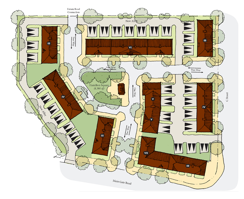
Program Summary
- Building Types: Two-story live/work units (with three-story option)
- Program: 31 units in eight two-story buildings. All units are 720 square feet, with 720 square feet of flex space. Units could be 1,440 square feet if buildings go up to three stories
- Density: 11.5 du/acre
- Parking: 94 parking spaces (62 off-street spaces, 32 on-street)
- Open Space: 4,380 square feet of community green plus tree-lined streets
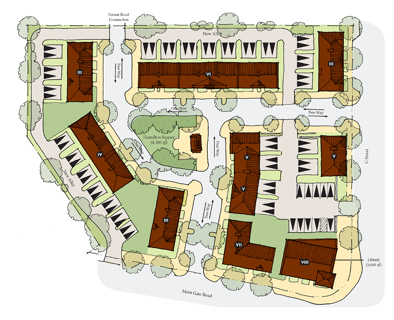
Option 1-C: Live/Work with Public Library
The only difference in this scheme and the one above is a small, 3,000-square-foot public library is integrated onto the corner of the site, at the request of the City. A small public program like this is great to consider because it is a welcome community amenity, an effective way to create foot traffic for small businesses in live/work spaces, and a way to build goodwill that will likely make an entitlement process smoother. In essence, this scheme is creating a small village center. Note that integrating this type of public program Is only possible if on-street parking can be counted toward required off-street parking, and the amount of required off-street parking is fairly low. Otherwise, integrating this program will likely compromise the economic viability of the site and the quality of the place. No one wants to live in housing that feels like it is in the middle of a parking lot.
Program Summary
- Building Types: Two-story live/work units (with three-story option)
- Program: 29 units
- Density: 10.5 du/acre
- Parking: 100 parking spaces, including 68 off-street spaces (with 10 for library) and 32 on-street
- Open Space: 4,380 square feet of community green plus tree-lined streets
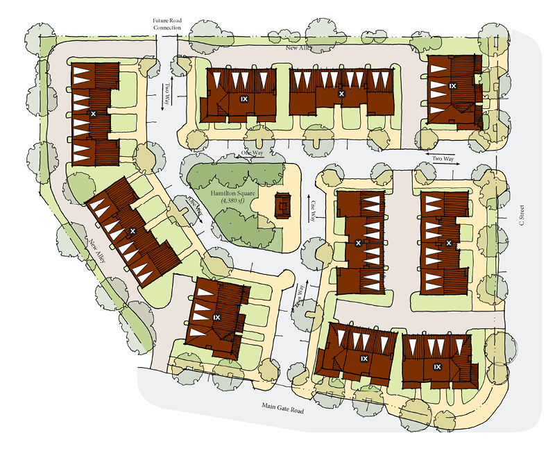
Option 1-D: Tuck-Under Townhouses
This alley-loaded tuck-under type is the lowest hanging fruit for most builders. In many instances, we encourage our clients to think beyond this type because a three-story unit with lots of stairs limits the range of potential buyers; lots of builders are building these types in most markets so there will be lots of competition; and these types do not create great urbanism because the ground floor is not very active, even if there is a room in front of the garage on the ground floor. That being said, with a good street and block network and careful placement and orientation, you can create a good place with these types—note that the fronts of the buildings face the street, and the sides and fronts of buildings (entries) never face the backs of other buildings.

Program Summary
- Building Types: Three-story, tuck-under townhouses
- Program: 34 total units, with three unit plans ranging in size from 1,167 to 1,624 square feet. (This height later became part of a compatibility conversation)
- Density: 13 du/acre
- Parking: 87 total parking spaces, including 56 off-street spaces and 31 on-street spaces (2.6 per unit). All 56 off-street spaces are in direct-access garages
- Open Space: 4,380 square feet of community green plus tree-lined streets
We also explored some initial options that did not use the shared framework and detail two of those options below.
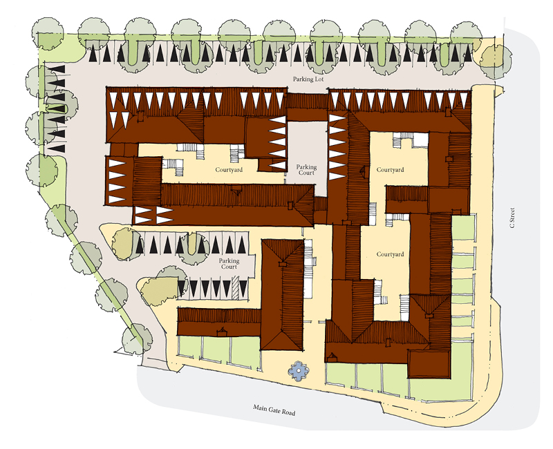
Option 1-E: Courtyard Housing
This courtyard housing layout proposed quaint, two-story buildings enclosing a series of three courtyards. A paseo goes north-south through the site, with a small forecourt/plaza with fountain at the street edge. Even at just two stories, this generated higher yields than many of the previous schemes.

Program Summary
- Building Types: One- and two-story courtyard housing with live/work units at corner
- Program: 40 units, with five unit plans ranging in size from 576 to 1,728 square feet. Units are one- to two-story and stacked, so they could be rental or condo
- Density: 15 du/acre
- Parking: 92 on-site parking spaces, including 46 enclosed and 46 open (two per unit plus four per 1,000 square feet of flex space, and for guest parking)
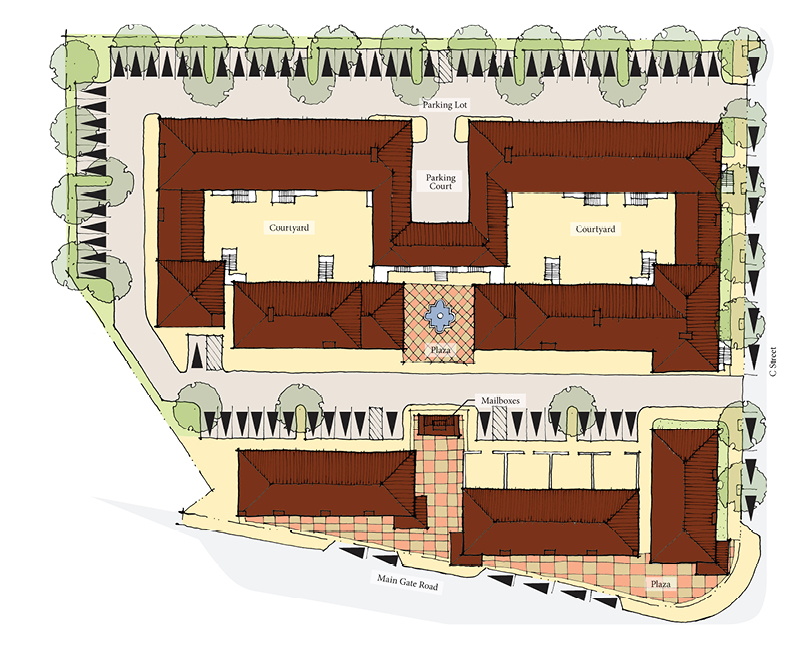
Option 1-F: Courtyard with Live/Work along Primary Street
This scheme has the same two large courtyards to the northern edge of the property, but introduces live/work units along the main street on the site’s south edge. This scheme generates the highest yield of all schemes, partly due to lower parking ratios.
Program Summary
- Building Types: Courtyard housing with live/work units at front along street
- Program: 58 units, ranging in size from 576 to 1,728 square feet. Units are one- to two-story and stacked, so they could be rental or condo
- Density: 22 du/acre
- Parking: 110 off-street spaces; 36 are tandem
The preceding schemes produced a range of discussion items—including the amount of open space, for sale or rental options, viability of live/work, and tradeoffs between yield and placemaking—and informed some key decisions in the project. In part two of this post, we will look at the selection of a preferred alternative and refinements that generated a final plan and submittal package!
Want to see the Missing Middle site planning process from start to finish? Download Daniel’s full white paper here.