He decides to develop a new kind of neighborhood to differentiate himself in the apartment market and to integrate what he had learned from past projects, of course. The end result is the new walkable Prairie Queen neighborhood in Papillion, Nebraska, just outside of Omaha, being developed by Jerry Reimer of Urban Village with planning and architecture by Opticos.
A New Model for Multifamily/Rental Housing: A Missing Middle NeighborhoodTM
The neighborhood will be significant in several ways. Nationally, there has not been a new, walkable, New Urbanist neighborhood of its kind developed with only Missing Middle Housing types; it will serve as a much-needed model for the Omaha and Lincoln regions, whose previous attempts at New Urbanism have fallen short on implementation quality; and this project will also define a new type and quality of multifamily housing (to use a loaded term) in the country.
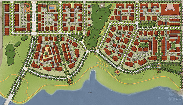
The site is 50 acres with a rolling topography that leads down to a small lake. The overall program will be over 500 units, ranging in size from 864 to 1,500 square feet, of which a majority will be small and large fourplexes, sixplexes, mansion apartments, forecourt apartments, townhouses, and live-work units. The Opticos mews units that we originally designed for Daybreak, Utah are also being built in a different site layout to create a small, inner-block courtyard configuration. Additionally, we nestled a few “tree houses” into the edge of preserved creek corridor open space to provide a few unique, detached units that will likely get maximum rents per square footage.
Balancing Quality with Needed Efficiency: Mass Customization – Introducing the Efficient MM-Interconnect™ System
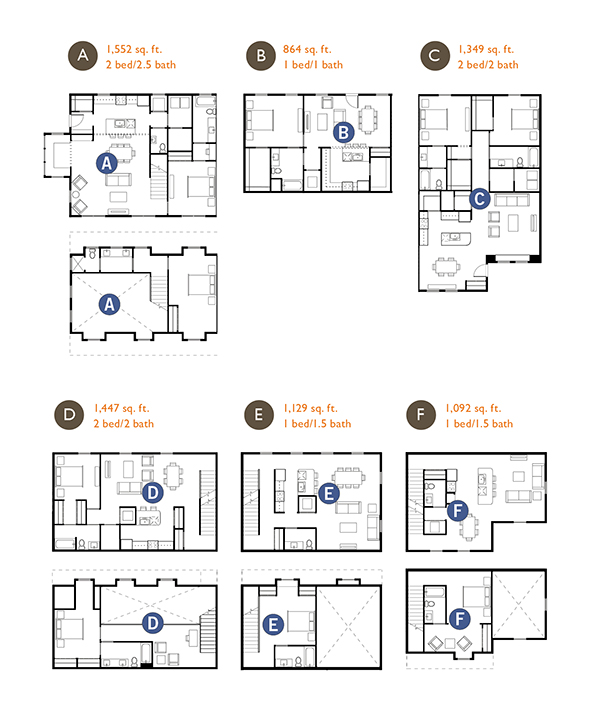
Jerry Reimer is a numbers guy who constantly kept us in check with needed cost efficiencies that will enable him to deliver the vision of this neighborhood. He came up with the term “mass customization,” which means utilizing various Missing Middle buildings throughout the new neighborhood to make all of his renters feel like they are living in a custom unit more like a house than an apartment. To achieve this, Opticos designed six core unit plans as a “kit of parts” that could be combined in different ways—including side-by-side, front-to-back, and stacked—to make a a variety of building types (think Tetris).
We are calling this kit of parts MM-Interconnect™, and this seemingly simple idea was the core design concept to make the unit plans and buildings work. All of the units are based on a nine-foot module so that different units could be stacked, rarely with the same unit stacked on top of each other. The challenge was to achieve the desired mix of unit types, while also making sure that, as the buildings are composed with these units, the entries are placed in the right locations and that windowless rooms do not end up on the front or courtyard elevations. To top it off, all the buildings are 100% efficient with no square footage for shared circulation that is not leasable.
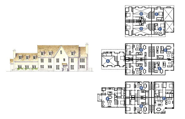
The initial design was the mansion apartment, which showed Jerry the potential of the MM-Interconnect™ system, our ability to deliver housing that provided sufficient yields and quality living, and architecture that felt like it belonged in Nebraska. This type in particular was based on the early-20th-century mansions of the Fairacres neighborhood in Omaha. Outside, the building looks and feels like a mansion; it just happens to have seven or eight units in it. The type is primarily located along the meandering Lake Drive to create a prominent address and identity for the project.

The Master Plan: Building a High-Quality Brand and Reinforcing the Unique Features of the Site
The site plan introduces a fine-grain network of narrow streets and blocks to maximize walkability (yes, narrow streets are truly critical for creating a quality neighborhood). There are three primary elements of the plan: Lake Drive, mentioned above, which will be a tree-lined promenade linked to a regional lakeside trail; a small center/neighborhood main street at the southwest corner of the project area that is defined by live/work units (amenity centers are needed to provide walkability); and two diagonal axes that lead from the high points of the north and south sub-areas of the site down to the lake.
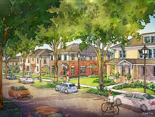
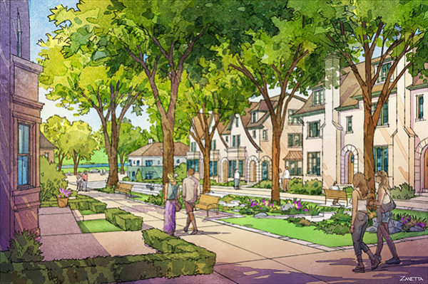
The axis on the southern portion is pedestrian only, thus providing a green spine that captures views down to the lake, even for units at the top of the hill (see perspective image below). Look closely at the plan to notice the careful distribution—or what we often call assembly—of types across the plan. Each block has multiple types within it, and most importantly, “like faces like” across streets—meaning that you have the same group of types framing both sides of the street.
The Need to Get Creative with Parking: No Podiums. No Parking Lots. Low Off-Street Parking Ratios
Ensuring that the accommodation of parking does not drive the site plan or building design is a key characteristic of successful Missing Middle types. In order to maximize the quality of the neighborhood we were creating, one of the design objectives was to create a plan without any large surface parking lots.
How was this possible? To start, alleys have been integrated into all the blocks, providing efficient access to parking to the rear of buildings. (Typically one space per unit is provided off-street at the rear of the building.) As most great residential streets do, the new streets accommodate on-street parallel parking on both sides, both to provide the necessary parking and to slow cars down as they travel through the neighborhood.
The combination of off-street and on-street parking throughout the project area generates a two-per-unit parking ratio. Some of the ground-floor units will get direct-access parking from the garage at the rear of the building, but not to the point where it compromises the types or the quality of the site plan. One diminutive, inner-block parking lot was created at the southwest corner of the site, adjacent to the mixed-use center and pool, to provide a small amount of supplemental parking for those uses.
Incubating a Neighborhood Center While Minimizing Risk
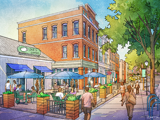
One of the concepts integrated into this plan is a lively neighborhood center. Instead of building a large clubhouse, we designed a series of Main Street-style live/work units with ground-floor flex spaces (25’ x 35’) that in the short term can accommodate a gym and community space, in addition to the sales office and management offices. There is also the near-term opportunity for Urban Village to subsidize a small coffee shop or shared work space. These are the type of unique, “urban” amenities that millennials and boomers are looking for and will differentiate the project from suburban garden apartments by providing funky vibrancy and social gathering places.
The center could be further activated with small, one-story temporary buildings and with programming of food trucks and/or Airstream trailers to test the market. The town center for the much-lauded Seaside, Florida was incubated in this same way 35 years ago and is still evolving.
The Inevitable Challenges and a Few Techniques to Address Them
Innovative projects like this have their challenges. We were fortunate to get Jerry Reimer’s support early on to push for good street design as the foundation of the plan, which meant that we had to have the typical challenging conversations with the local engineers and emergency response representatives. This has to be done to create a great project. My advice is to start these conversations early, have them often, gather examples to illustrate where this has been done in other projects across the country, and build the support of local elected officials to help push for good street design.
A key win? Streets exit onto neighboring arterial and collector streets at vastly smaller distances from the major intersections than the city’s standards typically require. (They are likely going to become right-in and right-out, but we consider this an important win for connectivity and quality.)
Secondly, determining the size of units was a challenge. Should the units be similar in size to suburban garden apartment competitors, or go a little smaller, since they are providing more value in the overall community? The units ended up being between 864 and 1,552 square feet, which I feel is on the big side, but it is likely that the unit size may be reduced in later phases once the quality of the place has been established. At this point, we need to prove that people are willing to trade size for quality of place and access to amenities in a walkable neighborhood.
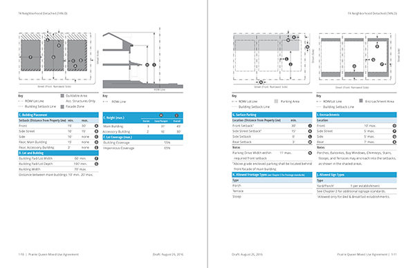
The project is being entitled through a Mixed-Use Development Agreement (MUDA) with the City of Papillion, Nebraska. Urban Village hired Opticos to lead the master plan, architecture, and the creation of a Form-Based Code that will serve as the zoning for the project under the MUDA. The application has been submitted, site grading is being refined, and we are working on the architecture of the building types. The project is scheduled to come out of the ground in 2018, and we look forward to seeing this project in my home state come to life! If executed as envisioned, we feel it will be a model for people around the country to visit and learn from, especially with Missing Middle Housing at its core.